TeePublic Design System
TeePublic is a B2C e-commerce print-on-demand marketplace, featuring creator-generated artwork on apparel, accessories, and home goods for customers to purchase.
I led the creation of an accessible design system and branded component library as part of TeePublic’s brand redesign and customer retention efforts.
More details coming soon.
-
Company
TeePublic (Articore)
-
Industry
E-Commerce
-
Platform
Website
-
Project
Case Study (2022)
Project Context
The TeePublic Product Design team was responsible for redesigning all aspects of the e-commerce customer journey as part of a broader company customer retention initiative. A full site redesign required building out a new, comprehensive design system for key site styles, elements, components, and pages.
I was a core design stakeholder, providing UX and accessibility guidance. Myself and another product designer audited all elements on the TeePublic site, followed by a multi-year phase of design system planning and implementation.
Problem Space
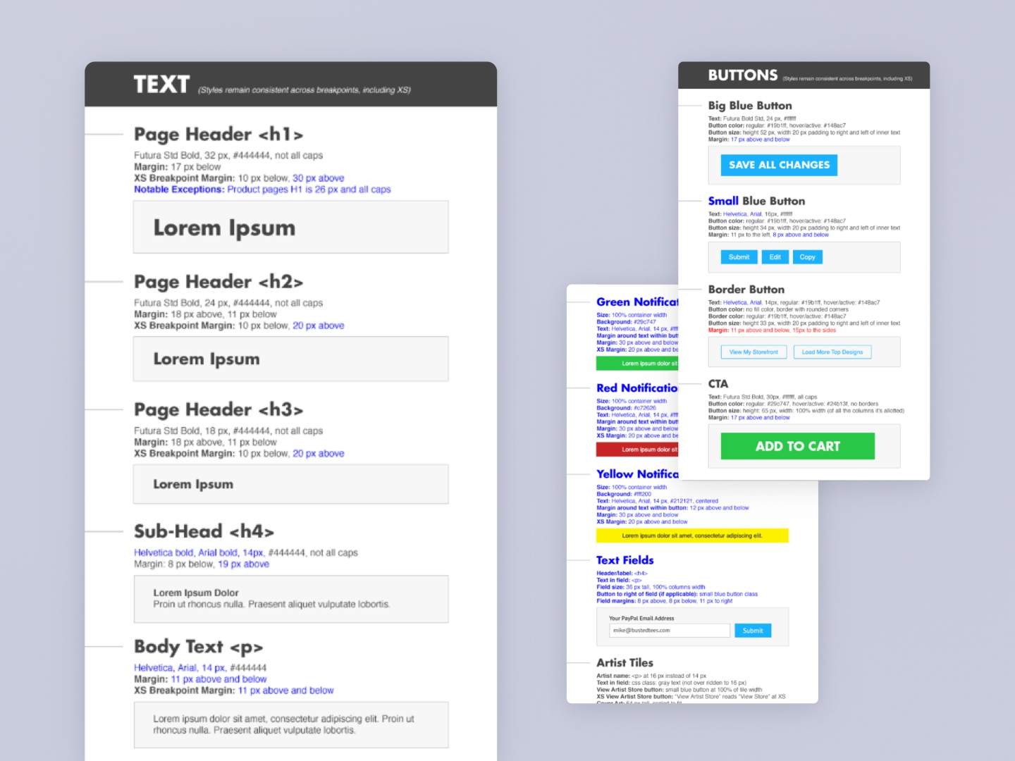
The original TeePublic component library lived in Sketch, and needed to be migrated and updated into Figma for easier maintainability.
The original site styles were inconsistent off-brand, so reusable tokens and components would enable designers and engineers to implement components consistently and quickly.
The site did not meet minimum accessibility requirements, so a thoughtful implementation of color and typography would help the site meet the AA WCAG compliance.
Phase 1: Audit & Discovery
Myself and another product designer began by auditing all elements on the TeePublic site.
This analysis revealed that color and typography were two critical foundational elements that needed to be addressed first as part of the brand refresh. We also collaborated with the Creative team to ensure that the new brand colors would be accessible in the digital experience.
The audit included evaluating static style guidelines previously created in Photoshop.
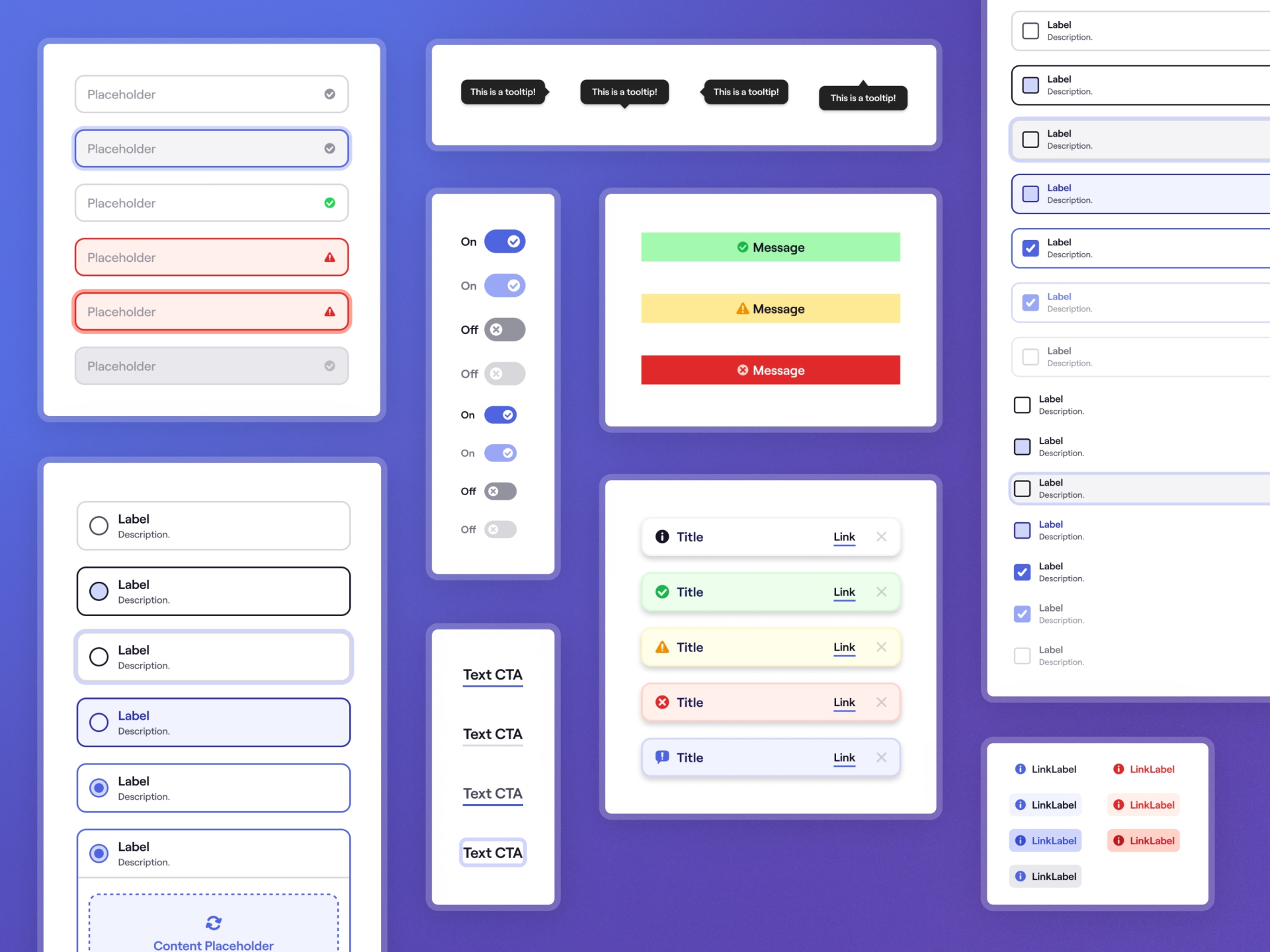
Phase 2: Design Tokens and Component Library
In collaboration with my design colleague using FigJam, we mapped out a comprehensive design token framework.
Defined Token Structure: We organized proposed tokens across multiple levels, and established clear, scalable naming patterns.
Set Project Scope: We defined the initial tokens for typography, colors, spacing, shadows, and border radius.
Redesigned Core Components: In Figma, we focused on updating our libraries of type styles, buttons, form field inputs, popovers, and system icons using the new system.
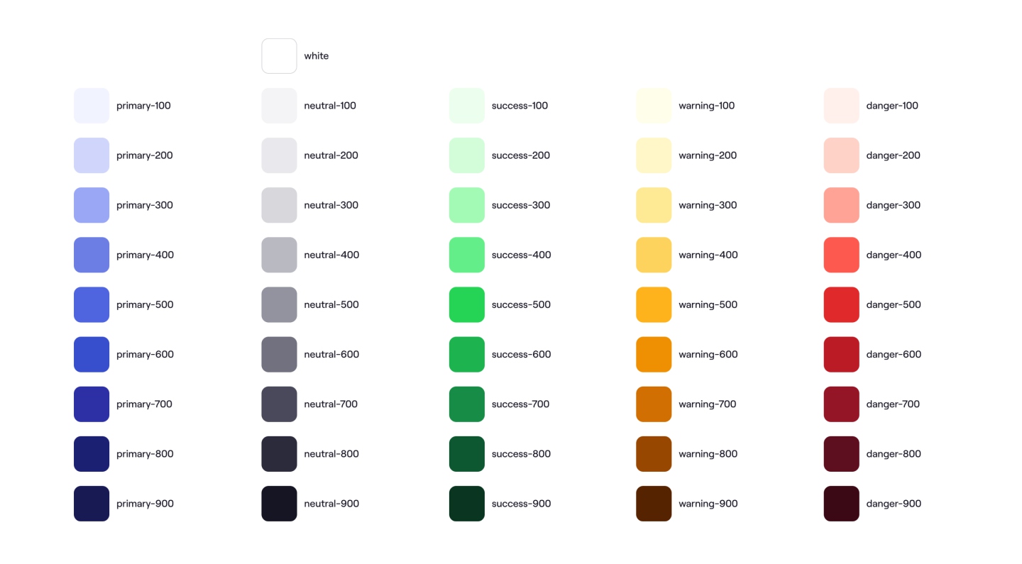
We coordinated with the Creative team to align on an accessible color palette that could also work for light and dark color modes.
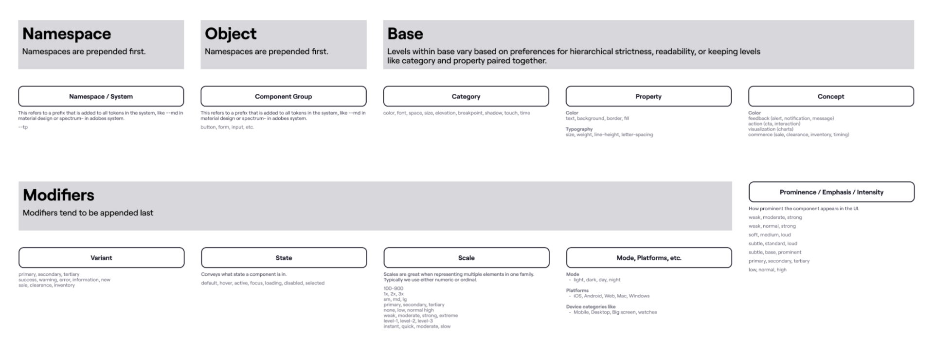
We spent time researching and aligning on design token naming conventions.
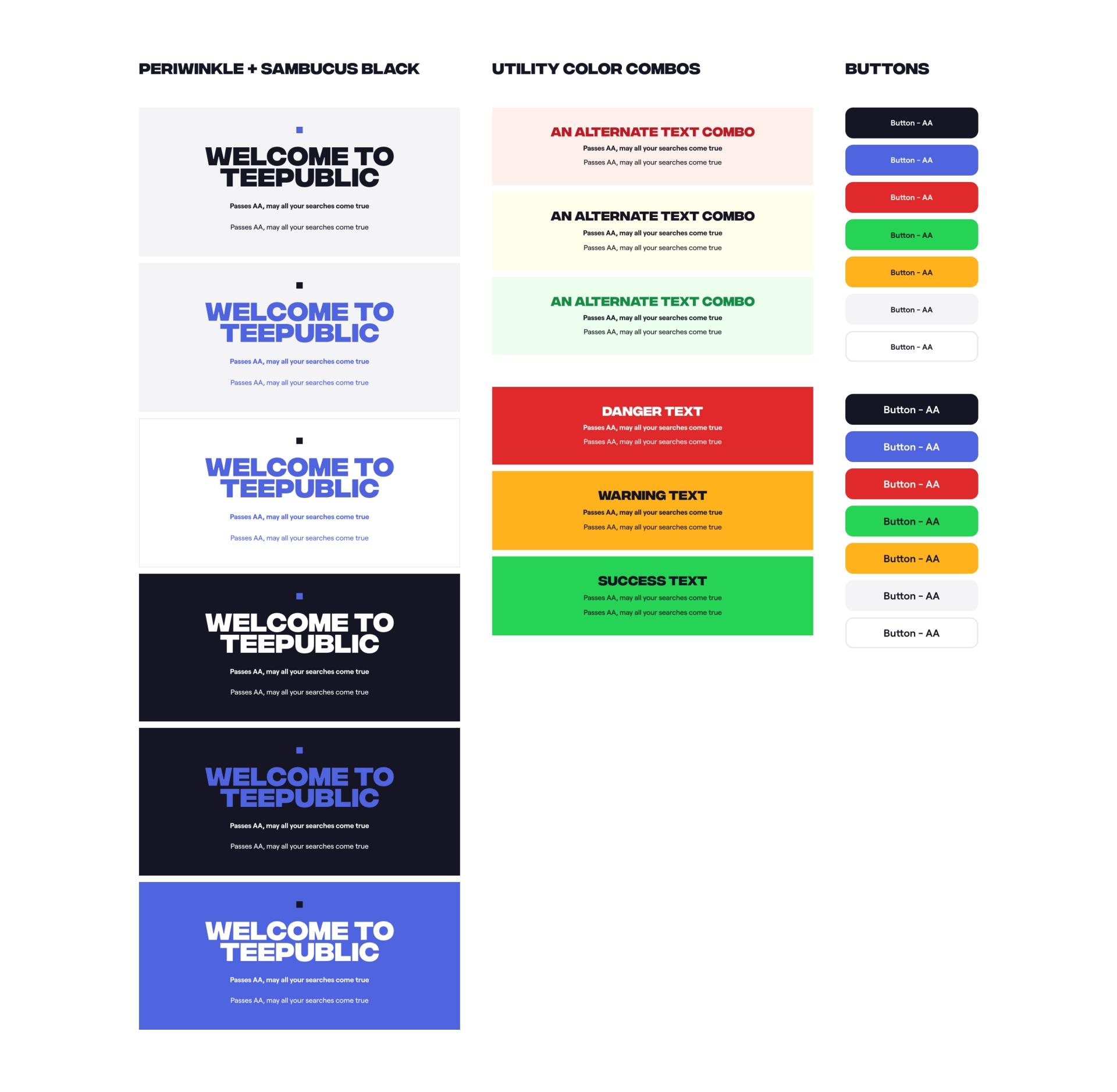
Accessibility evaluations were created in Figma with final brand color and type combinations.
Phase 3: Implementation
The most impactful phase involved extensive collaboration with the engineering team.
Held Pairing Sessions: We conducted hands-on pairing sessions to implement design tokens into production code.
Defined Technical Artifacts: We worked with engineering to created a full suite of reusable SCSS variables, mixins, and Rails view components.
Refinement: We tested and refined the implementation across each redesign phase.
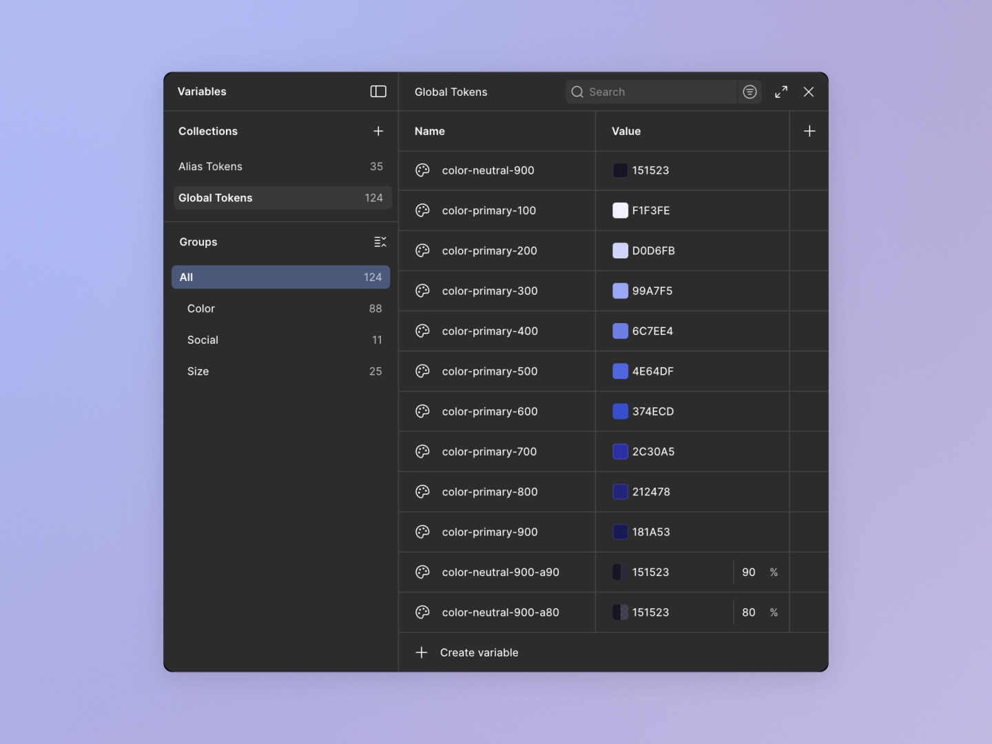
We utilized Figma's design tokens feature to establish our global and alias tokens for use in the component library.
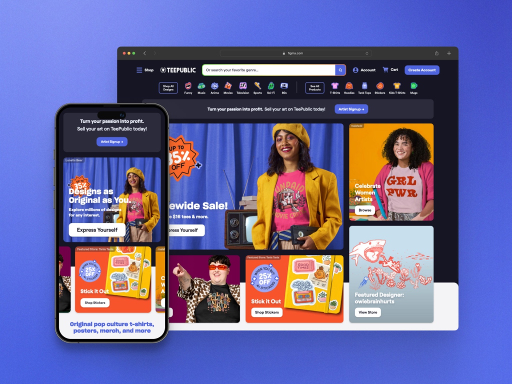
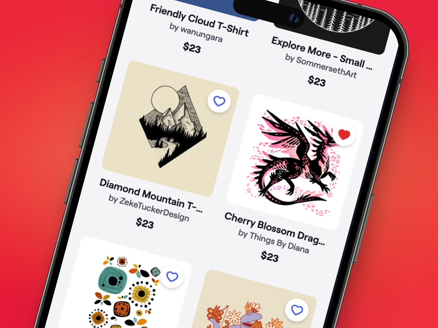
Design system implementation on the Home page. The updated promotional Marketing Tiles promote current sales, featured artists, and merchandise. It's fully responsive across all viewports and is managed with a custom backend tool.
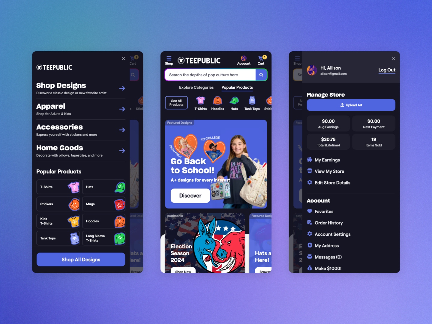
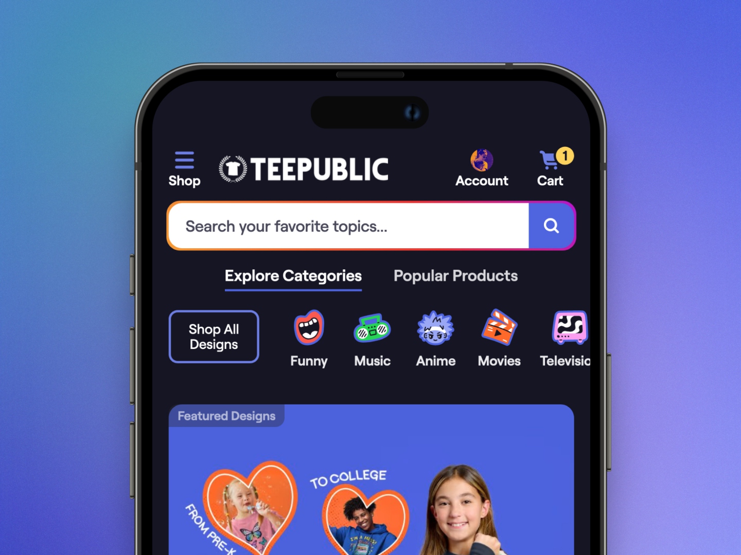
The new Navigation experience, launched in February 2024, utilizing the new TeePublic design system.
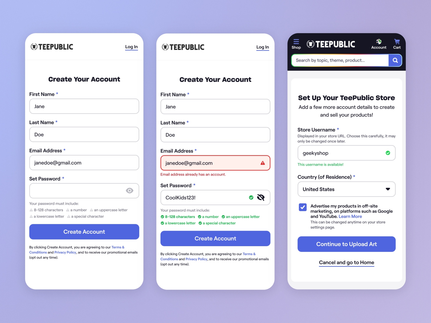
Design system implementation in the signup and artist onboarding flow.
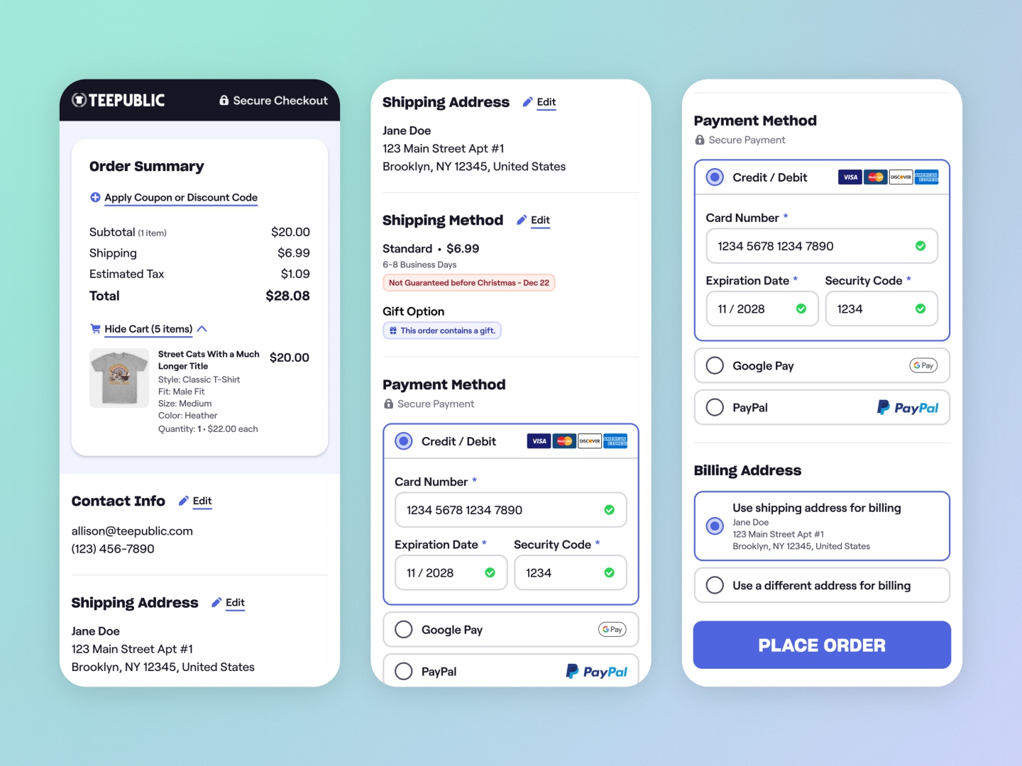
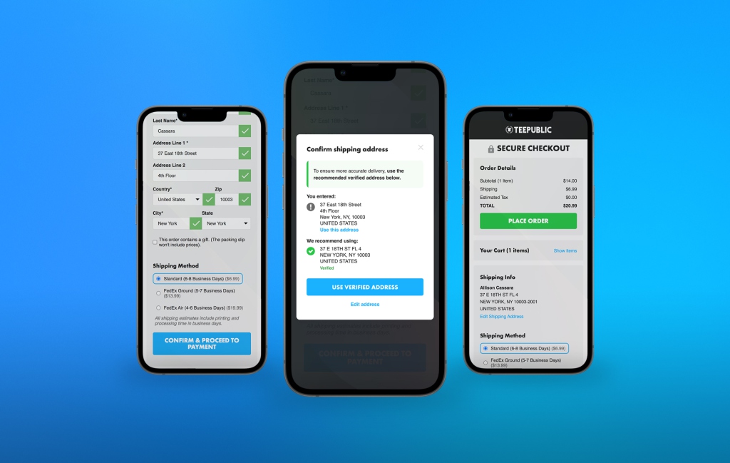
Design system implementation in the checkout flow.
📊 Project Results & Impact
The investment into a new design system enabled a series of successful redesign projects that have modernized the TeePublic customer experience.
Completed 8+ redesign projects utilizing the new branded design system that led to improved conversion rates.
A unified visual language and component set ensured minimum WCAG compliance and consistent implementation.
Disclaimer: Some specific project metrics are confidential.